The White Background Method: Detecting Color Zoning in “AAA” Grade Stones
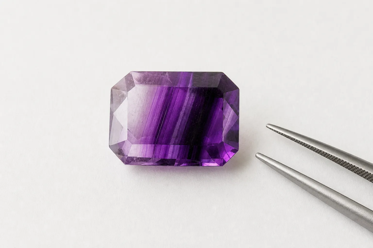
A plain white background can make Amethyst Color Zoning easier to see. Put the stone—or the product photo—against clean white and look at the face-up view. Bands, pale patches, dark pools, washed-out corners, and sudden shifts in saturation often stand out more clearly when the background is not adding color, shadow, or drama.
That is the useful part of the method. It helps you judge visible color distribution in a stone marketed as “AAA.” It does not certify the grade, identify origin, establish treatment history, separate natural from synthetic material, or calculate value.
What the white background check shows
The point is to remove visual clutter: colored trays, black velvet, warm display lighting, purple packaging, busy hands, and reflective surfaces. Against a neutral white field, the eye has an easier time comparing one part of the amethyst with another.
For a cut stone, start with the face-up view—the way the gem is normally seen in a ring, pendant, parcel, or listing photo. You are looking for the pattern of color across the visible top of the stone, not just whether the stone is generally purple.
On white, check for:
- Bands: visible stripes or lines of stronger and weaker purple.
- Patches: irregular areas that look lighter, darker, grayish, or less saturated.
- Pale zones: sections where purple weakens toward lavender, pinkish violet, or near colorless.
- Dark zones: areas where the color becomes so concentrated that the stone looks closed or lifeless.
- Washed-out areas: parts of the face-up view that look thin in color, often near the center, corners, or edges.
- Uneven saturation: a shift from rich purple to weaker purple across the same stone.
This is a color-distribution check. Amethyst is a purple variety of quartz, but color quality is not only hue. Tone, saturation, and how evenly the color appears across the face-up view all affect how the stone reads to the eye.
How to use it without over-reading it
Use the white background as a buyer’s screening aid, not as a formal grading procedure.
If the stone is in hand:
- Use plain white paper or a matte white surface. Avoid glossy backgrounds that create hard reflections.
- Choose steady, neutral light. Daylight near a window or a balanced lamp is usually more useful than very warm showroom lighting.
- Look face-up first. That is the view most connected to appearance in jewelry or a listing.
- Tilt gently. Do not hunt for one perfect angle. Ask how the stone looks through a normal viewing range.
- Compare center, corners, and edges. Zoning often becomes obvious when you check whether all areas carry similar strength of purple.
- Separate color from reflection. A bright facet flash moves as you tilt the stone; a body-color pattern tends to stay in the same general area.
If you are judging photos:
- Prefer listings with a white or light neutral background.
- Be cautious when every image uses black velvet, purple props, heavy contrast, or warm lighting.
- Look for more than one angle.
- Notice whether pale corners, bands, or darker zones repeat across images.
- Ask for a straight-on white-background photo if the listing uses “AAA” language but the color distribution is hard to read.
A photo can still mislead. Exposure, white balance, editing, lens angle, and lighting direction can all change how amethyst tone and saturation appear on screen. The white-background mindset helps, but it does not remove every uncertainty.
Why “AAA” deserves a closer look
“AAA” sounds exact, but for amethyst it is usually commercial language, not a single universal grading standard. Sellers may use it to suggest a premium stone, but the meaning can vary from one listing to another.
That does not make the label useless or suspicious by itself. It means you should translate the claim into visible features:
- Is the purple attractive?
- Is the tone neither too washed out nor overly dark?
- Is the saturation pleasing?
- Does the face-up color look balanced?
- Do bands, pale areas, or dark patches interrupt the premium impression?
The white background method is especially useful when a listing says things like “AAA amethyst,” “top grade,” “deep purple,” “rich saturation,” “fine color,” or “premium quality.” Those phrases are easier to assess when you ask one grounded question: does the visible color distribution support the impression being sold?
A stone can have a beautiful purple hue and still show obvious zoning. Another may be lighter overall but more even. The white background does not decide which one you should prefer; it helps you see the tradeoff before you buy.
What may be a concern, and what may simply be character
Visible zoning in amethyst is not automatically a flaw in every context. Amethyst is quartz, and uneven color can reflect natural growth patterns or internal color sectors. In a crystal specimen, slice, or display piece, zoning may be part of the appeal.
The context changes when a faceted stone is sold as a clean, premium-looking “AAA” gem. In that setting, the buying promise is usually about attractive face-up color, so obvious unevenness matters more.
A practical way to read what you see:
- Minor zoning may be acceptable if it does not distract from the overall appearance.
- Pale zones can weaken the face-up impression, especially in smaller cut stones.
- Strong bands or patches may conflict with a premium color claim.
- Dark concentration can be a concern if part of the stone loses liveliness.
- Specimen character is different from a faceted-gem quality claim.
The method does not tell you whether zoning is “bad” in an absolute sense. It shows whether the color pattern is visible enough to affect how the stone looks.
Common misunderstandings
If it is purple, is it high quality?
Not necessarily. Purple color gives the general amethyst identity, but quality depends on more than hue. Tone, saturation, color distribution, cutting, clarity, and face-up appearance all influence the visual result. A stone can be purple and still look uneven, grayish, too dark, or washed out in places.
Does visible zoning mean the amethyst is imitation?
No. Visible zoning should not be treated as proof of imitation. Color zoning can occur in amethyst, and similar-looking patterns can appear in different contexts. A white-background check is not a natural-versus-synthetic test.
If identification is the real question, visual inspection alone is limited. Gemological testing may involve instruments and criteria outside a simple buyer check. The white background method stays narrower: it helps you inspect face-up color evenness.
Does the method show treatment history?
No. Amethyst color can be studied through trace elements, irradiation, heat effects, and absorption behavior, but a plain white background cannot diagnose those factors. It may help you notice an unusual or inconsistent appearance, but it cannot establish treatment history.
Does zoning always lower value?
No. Color is important in colored gemstones, but value is not determined by one visual feature alone. Size, cutting, clarity, overall beauty, documentation, market context, and buyer preference also matter. A visibly zoned stone may be less convincing under a premium “AAA” label, but this check does not calculate a value reduction.
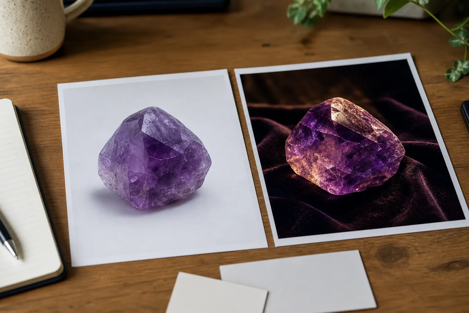
Reading product photos with this method in mind
Many buyers first see amethyst online, where handling the stone is not possible. You can still use the logic of the white background check.
Start with the photo environment. A white or pale gray background is not automatically more reliable, but it usually makes color easier to read than purple packaging or dramatic black velvet. Dark settings can make pale stones look richer. Warm lighting can soften the look of purple. Strong contrast can make saturation appear deeper on screen.
Ask:
- Does the central face-up area stay evenly purple?
- Do the corners fade?
- Is one side noticeably darker?
- Are there diagonal, angular, or banded zones that repeat across images?
- Does the stone look rich only in shadowed photos?
- Are pale areas hidden by glare in the main image?
If a seller describes the stone as “AAA” but provides only one stylized image, you have limited visual evidence. A reasonable next step is to ask for a straight-on photo against plain white, without extreme backlighting or heavy shadow.
Mounted jewelry is harder to judge. Metal color, prongs, backing, and surrounding stones can influence perception. A white-background photo of the finished piece still helps, but it may not reveal zoning as clearly as a loose-stone image.
Quick checklist for an “AAA” amethyst listing
Use this before treating the label as meaningful:
- Face-up evenness: Does the purple look balanced across the visible top?
- Saturation shifts: Are there sudden changes from rich purple to weak lavender or grayish areas?
- Pale zones: Do corners, edges, or the center look washed out?
- Dark zones: Are any areas so dark that they reduce the lively purple appearance?
- Banding: Are lines or angular zones visible without magnification?
- Photo context: Are there neutral-background images, or only flattering display shots?
- Claim match: Does the actual color distribution support the “AAA” impression?
- Limit of the check: Are you using the observation only for visual screening, not for origin, treatment, authenticity, or appraisal conclusions?
If the stone looks even on white, that does not certify it. If it looks uneven, that does not prove misrepresentation. It gives you a clearer basis for comparing stones, asking better questions, or deciding whether the price and description still feel appropriate.
The useful takeaway
The white background method is a simple visibility tool. It reduces background influence so bands, patches, pale areas, dark areas, and uneven saturation are easier to notice.
For stones sold as “AAA,” that matters because the label often creates an expectation of strong, attractive, even face-up color. A white background helps you test that expectation visually. Use it to slow down the first impression and make amethyst color zoning easier to discuss before you buy.