Buyer clarity note
Zambian Royal Purple: Why Inclusions Are the Price of Intensity
A vivid Zambian Amethyst should not be rejected just because you can see inclusions. The better question is simpler: do those inclusions interrupt the stone’s face-up beauty?
In amethyst, color carries a lot of weight. A rich purple hue, balanced tone, and strong saturation can make a stone desirable even when it is not perfectly clean. But inclusions are not automatic proof of Zambian origin, Kariba mine origin, stronger color, or higher value. “The price of intensity” is best understood as a buyer’s tradeoff, not a geological rule.
If the purple comes first and the inclusions stay visually quiet, a little clarity compromise may be reasonable. If the inclusions are what your eye notices first, the color label is doing too much work.
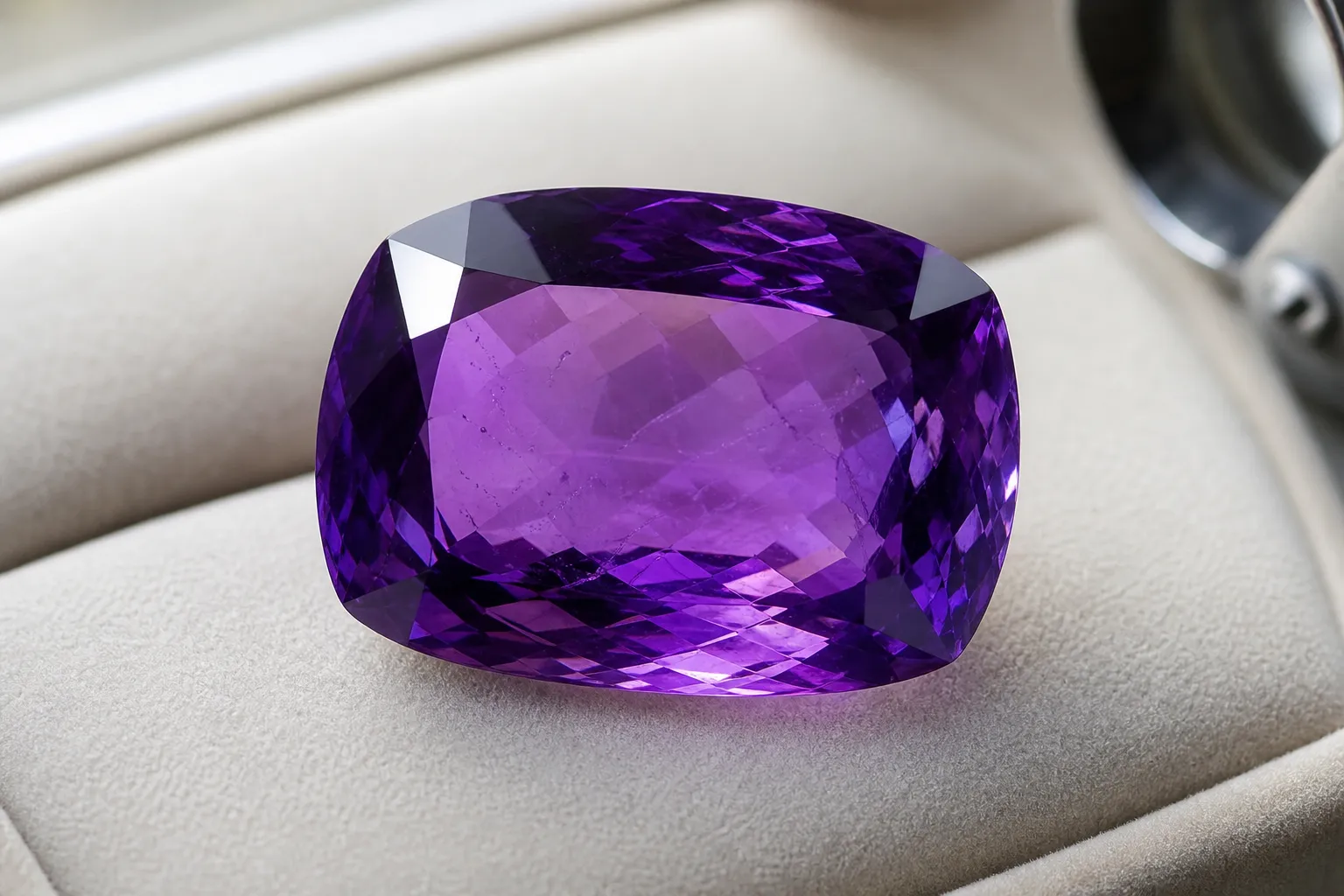
The real tradeoff: color versus interruption
Amethyst is purple quartz, and its violet color has a real mineral basis. Research on amethyst color commonly discusses iron-related centers and irradiation effects within quartz. That context matters, but it should not be stretched too far: the tiny structural causes of purple color are not the same thing as the visible veils, feathers, clouds, crystals, or dark specks a buyer may see.
For buying, the practical standard is face-up appearance. Amethyst quality is judged through color, tone, saturation, clarity, cut, and overall look. A clean but pale stone can feel less compelling than a richly saturated stone with a few small inclusions. A saturated stone, however, can lose appeal if its inclusions break up the color, make it look sleepy, or sit in the most visible part of the gem.
A useful first pass is to ignore the origin label and ask:
- Does the stone still read as richly purple from the top?
- Are the inclusions obvious at normal viewing distance, or only when searched for?
- Do they reduce brightness, transparency, or the shape of the cut?
- Is the tone so dark that parts of the gem look blackish?
- Is the color pleasing across the stone, or patchy and uneven?
If the overall look still works, minor inclusions may be acceptable. If the flaw leads the eye, color alone is not enough.
When inclusions are acceptable in royal-purple amethyst
Visible inclusions in amethyst are not all equal. A small mark near the edge of a faceted stone may have little effect. A bright fracture across the center of a ring stone matters much more. A crystal cluster has different expectations again: natural texture, zoning, and growth features may be part of its appeal, while a calibrated ring or pendant stone is usually judged more strictly for clarity from the top.
In a vivid “royal purple” amethyst, inclusions are easier to accept when they are:
Small and scattered
They do not collect into one distracting patch.
Away from the center
They sit near the edge, back, girdle, or a less visible zone.
Visually soft
They do not create harsh white flashes, dark spots, or obvious surface-reaching breaks.
Balanced by strong color
The stone looks purple and lively before it looks included.
Not harming the cut appeal
They do not make the gem seem dull, cloudy, or poorly finished.
Face-up appearance matters because that is how most jewelry is worn. A Zambian amethyst ring is usually seen from above, on the hand, in mixed light. A pendant may be viewed from farther away. A bracelet stone moves constantly, so small inclusions may be less noticeable than they appear in a still macro photograph.
Photos can distort the decision in both directions. A close-up image may make a minor inclusion look severe, while a saturated product image may hide clarity issues. If clarity matters to you, ask for ordinary daylight photos, a side view, and a short video rather than relying on one polished beauty shot.
When color does not justify the inclusions
Strong color cannot rescue every stone. Inclusions become a real problem when they dominate the gem’s appearance, reduce transparency, or make the stone look visually compromised.
Be more cautious when inclusions:
- form a central cloud that dulls the whole gem;
- create white, reflective fractures across the face;
- reach the surface in a way that affects polish or wear confidence;
- gather directly under the table of a faceted stone;
- make the color look muddy rather than saturated;
- combine with a very dark tone so the stone shows black-looking patches.
One common mistake is assuming the darkest purple is always best. Rich saturation is desirable, but overly heavy tone can hide the internal life of the stone. A gem can be described as royal purple and still look flat if it is too dark.
The opposite mistake is overvaluing clarity alone. A very clean amethyst with weak color may be pleasant, but it may not satisfy someone looking for the vivid Zambian look. In amethyst, clarity should support the color, not replace it.
“Blue undertone,” “Kariba,” and other market words need boundaries
Searches for Zambian Amethyst often include phrases such as “blue undertone,” “Kariba mine,” “royal purple,” “premium Zambian,” and “Zambian amethyst price per carat.” These terms can help describe what buyers are looking for, but they are not standardized grading terms.
A blue undertone usually means the purple leans cooler rather than reddish. Some buyers like that look and associate it with higher-end Zambian material. Still, a blue undertone does not by itself prove Zambian origin, Kariba origin, or a specific value level. It is a color description, not documentation.
The same caution applies to Kariba mine amethyst claims. “Kariba” appears in market language and may be used to signal desirable Zambian origin. Without reliable locality documentation or a suitable gemological report, the name alone should not be treated as proof of origin, price, or quality.
Separate the questions:
- Is it amethyst? Amethyst is purple quartz, and mineral identity can often be assessed through gemological methods.
- Is the color attractive? That depends on hue, tone, saturation, and face-up appearance.
- Is the stated origin supported? That requires more than a sales phrase or a color impression.
A stone can be beautiful even if the origin claim is not fully documented. A stone can also be genuinely Zambian and still be less desirable if its color, cut, or clarity are weak.
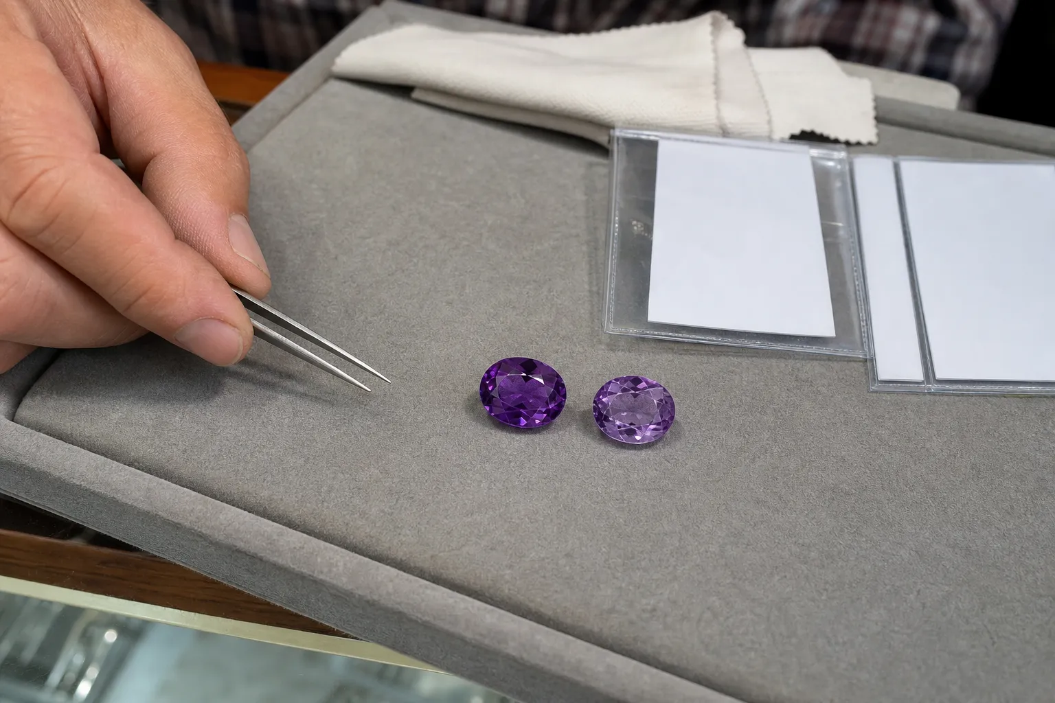
A short way to judge a vivid included stone
- Start with the naked-eye view, not the loupe.
- First, look at the gem face up in normal light. Do you see color first, or inclusions first? If the color leads and the inclusions recede, the tradeoff may be favorable.
- Second, turn the stone slightly. Some zoning is normal in amethyst, but the overall impression should remain pleasing as the angle changes.
- Third, check the center. Inclusions near the edge often matter less than inclusions under the table or in the visual heart of the gem.
- Fourth, compare it with a cleaner but paler option if possible. This is where the amethyst color-versus-clarity decision becomes real. Some buyers prefer stronger saturation with minor inclusions; others prefer a cleaner, brighter look. Neither preference is wrong.
- Finally, keep price language in perspective. “Zambian amethyst price per carat” sounds like there should be a simple formula, but value depends on the full quality picture: saturation, tone, clarity, cut, size, presentation, and confidence in the description. A loose stone, ring, pendant, bracelet, and crystal cluster are not judged in exactly the same way.
The evidence limit: inclusions do not prove intensity
The strongest buyer-facing support points to a combined quality-factor approach: amethyst should be evaluated by color, clarity, cut, and overall desirability, not by one feature alone. Mineral and spectroscopy literature also supports the broader point that amethyst’s purple color is tied to real features in quartz chemistry and structure.
What it does not prove is just as important. It does not prove that intense Zambian royal-purple amethyst must contain visible inclusions. It does not prove that visible inclusions create the blue undertone some sellers describe. It does not verify typical inclusion patterns from the Kariba mine. It does not establish a reliable premium for every stone labeled Zambian.
So the practical answer is balanced: do not reject a vivid Zambian Amethyst only because it has minor inclusions. Also do not excuse every inclusion because the stone is vivid, purple, or sold with a desirable origin name. The better choice is the stone whose inclusions remain secondary to its face-up beauty.
Quick buyer check
Before accepting visible inclusions in a vivid amethyst, ask:
- Is the color still the main visual impression?
- Are the inclusions minor at normal viewing distance?
- Does the stone remain bright rather than muddy or blackish?
- Are “royal purple,” “blue undertone,” or “Kariba” being used as description rather than proof?
- Would you still like the stone if the origin label were removed?
If yes, the inclusions may be a reasonable compromise. If no, keep looking.